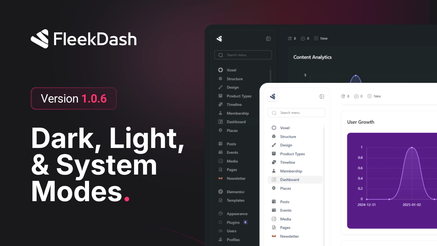
FleekDash 1.0.6 tightens appearance end to end, this is shell-level theming before the structured Theme Editor and Color Palette Manager that ship in 2.2.0. Light and dark modes look more intentional, contrast is easier on the eyes for long sessions, and when you hand control to the operating system, the admin tracks it automatically so you are never fighting the wrong palette after sunset or when your OS schedule flips.
For icons and logos that need to match the active surface, FleekDash applies lightweight, automatic color inversion in CSS instead of shipping duplicate assets. The browser handles the swap with minimal work, so the interface stays fast while graphics stay legible on both light and dark backgrounds.
What's New
Improved light and dark mode: cleaner separation between themes, with refinements to surfaces, borders, and text so each mode feels native rather than inverted by accident.
System mode: when enabled, FleekDash follows the OS theme preference (for example prefers-color-scheme: light or dark). If the user changes macOS, Windows, or Linux appearance, or a scheduled light/dark switch runs, the admin updates to match without a manual toggle in FleekDash.
Stronger contrast: text, controls, and key placements are tuned for readability and WCAG-friendly separation so dashboards stay scannable in both themes.
Lightweight icon and logo treatment via CSS: automatic inversion of icon and logo colors where needed so single assets read well on light and dark chrome. The approach stays lightweight (style-driven, no heavy image variants) for faster loads and simpler maintenance.
What's Improved
Consistent first paint when the shell resolves system theme on load, with fewer flashes between wrong and right mode.
Lower asset overhead for brand marks that must work in both themes, thanks to CSS-driven treatment instead of duplicating every raster or SVG per theme.