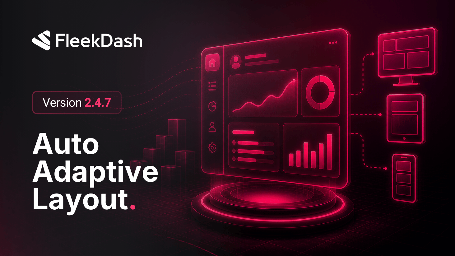
FleekDash now treats layout as something that responds to structure and context, not just screen width.
This is smart auto-adaptive layout: the interface repositions elements in a logical way so the experience stays balanced when things move. Examples include when a side panel opens or expands, when Split Mode changes how space is shared, or when multiple regions compete for attention at once.
That behavior runs across the application. The dashboard remains where we push extra polish for dense widgets and analytics, but the same adaptive principles apply elsewhere so the admin feels coherent end to end.
This goes beyond classic responsive design. Fluid breakpoints still matter, but the focus here is intentional reflow: keeping priorities clear, reducing overlap, and preserving a natural reading and work path as the shell changes state.
What's New
Split Mode on the dashboard: switch between split bottom and split top so you can shape the view to how you work, with the surrounding layout adjusting as a system instead of leaving widgets fighting for space.
Coordinated widget reflow where Split Mode is active: widgets redistribute for clearer hierarchy and balance when the split layout changes.
Global adaptive shell: side panels, splits, and main content work together so openings and transitions feel purposeful rather than accidental overlap.
What's Improved
Chart tooltip performance has been dramatically improved. Tooltips now glide smoothly along chart lines with zero re-rendering.
KPI card badge colors have been refined to better align with the FleekDash visual style.