You probably found FleekDash (or got excited enough to buy it) after watching a demo like the one below. No narration. No music. No text overlays. Just the interface in action. And you still got the value. That’s not a coincidence. It’s what happens when the product is intuitive enough to speak for itself.
We’re not writing this to brag. We’re writing it because the same thing that convinced you can convince your agency clients. If you can sell the user experience instead of the manual, you add real value to what you deliver. Here’s the story behind our launch, and how you can use the same idea.
How we sold $8,612 USD in 3 days with a single muted video
When we launched FleekDash, we didn’t have a fancy sales page with long copy or a voiceover. We had one video. Silent. No script, no “and here we have…”, no feature list. Just a screen recording of someone using the admin: opening the menu, editing a post inline, switching views. The kind of flow you’d show a client in a 10-minute call.
In the first 72 hours after posting it on Reddit and in a Facebook group, that single video drove $8,612 in sales. People didn’t need us to explain what FleekDash was. They watched, they understood, and they bought. That’s the power of an interface that’s clear enough to sell itself. Sales kept coming day after day, but the impact of those first hours, thanks to the simplicity of the launch, was especially memorable for our team.
Why does this matter for you? Because you’re in the same position we were. You have something good (a custom dashboard, a WordPress workflow, a client portal). The trap is to lead with how it works. The win is to lead with how it feels. When your client can see themselves using it, they’re already halfway sold. You’re not hiding complexity. You’re just showing the experience first. The numbers proved it for us. The same logic will work in your agency.
The trap of explaining complexity
Agencies often lead with capability: "We built a custom dashboard that integrates with your CMS, handles roles, workflows, and reporting." Technically true, and a great way to lose attention. The moment you start unpacking architecture, permissions, and data flows, you're asking the client to care about how it works before they've felt what it does.
Complexity, presented first, kills interest. The client didn't buy a system because they wanted to understand it. They bought it because they wanted to use it with minimal friction. So the goal isn't to explain the complexity. It's to make the complexity invisible until they're already sold on the experience.
When the system sells itself
The agencies that close the fastest are the ones that show, don't tell. They put the client in front of the dashboard and let them click. No long slides, no "and then over here we have…" If the UI is clear, the client finds what they need. If the workflows are obvious, they don't need a manual.
That doesn't mean the system is simple underneath. It can be very powerful. It means the surface is intuitive. The sale happens because the client thinks: "I could use this every day without calling anyone." That feeling is worth more than any feature list. So you're not really "selling complexity." You're selling an experience that happens to be backed by a capable system. The less you have to explain, the more the system is doing the job.
How to present power without the overload
You still have a lot under the hood: permissions, content workflows, integrations, maybe white-label branding. The trick is order of presentation. Lead with the outcome and the daily experience. "This is where you'll manage your content. This is where your team logs in. This is how you see what's live." Only when they're already interested do you peel back a layer: "And it's all tied to your WordPress site, so everything stays in sync."
You're not hiding complexity. You're revealing it at the right moment. Complexity that comes after interest is perceived as value. Complexity that comes before is perceived as risk or confusion.
Why FleekDash fits this story
FleekDash is built so that agencies can demo first, explain later. The dashboard is familiar: content, users, settings, all in one place. Clients don't need a training manual to understand where to go. That means your sales conversation can be: "Here's your site, and here's where you'll run it. Go ahead, click around."
The power (WordPress under the hood, white-label, plugins, workflows) is there when you need to mention it, but the first impression is "this is easy." Agencies use it to close deals precisely because they don't have to spend the meeting explaining the system. They let the user experience do the work. You already felt that when you watched the demo. Your clients will feel it when you put them in front of their own FleekDash.
What to do next
Agencies sell more when the system is so easy to use that they barely need to explain it.
If you're still leading with specs and architecture, flip the script. Lead with the user experience: put the client in the driver's seat, show one or two flows that matter to them, and only then add the "and by the way, it also does X." Sell the user experience, not the manual. When your system is intuitive enough, you'll find you're explaining less and closing more. And that’s how you turn a good delivery into something your clients keep paying for.
See how FleekDash keeps the user experience simple
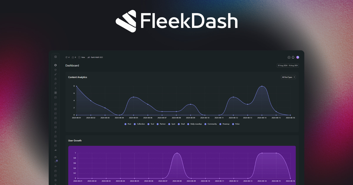
Replace the default WordPress dashboard with a fast, modern UI. Custom menu, inline editing, and a clean admin your clients will love.
 Modern WordPress admin UI
- White-label for agencies
- Custom menu & dashboard widgets
- Fast, lightweight & secure
This post was written for humans, not for SEO, and reviewed with AI.