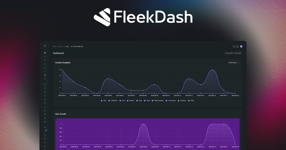
Tayshiro designs the FleekDash workspace — the visual system, the interaction patterns, and the small details that make an admin feel crafted instead of default. His work is the reason the data grid, the dashboard, and the login customizer look the way they do.
On the blog he writes about design decisions behind the product: spacing systems, motion in admin UI, how theme palettes work under the hood, and why consistency across screens matters for people who live in wp-admin all day. Expect posts about craft, not just features.
Good admin design is invisible until it saves you a click — Tayshiro's posts make the thinking behind that polish visible. Browse his articles below for a look at how FleekDash's visual language evolved and why specific interface choices were made.